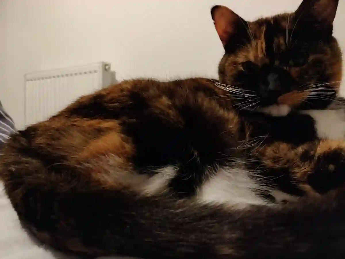
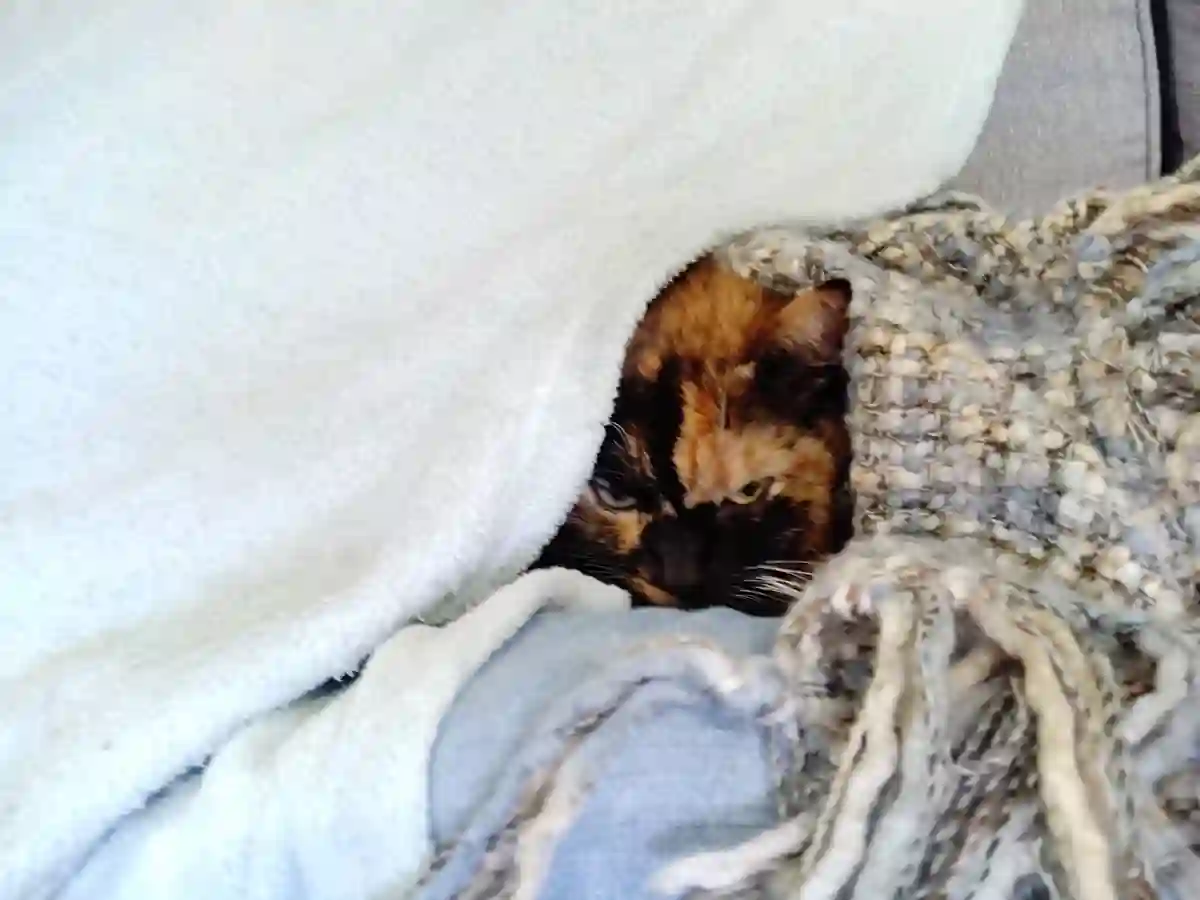
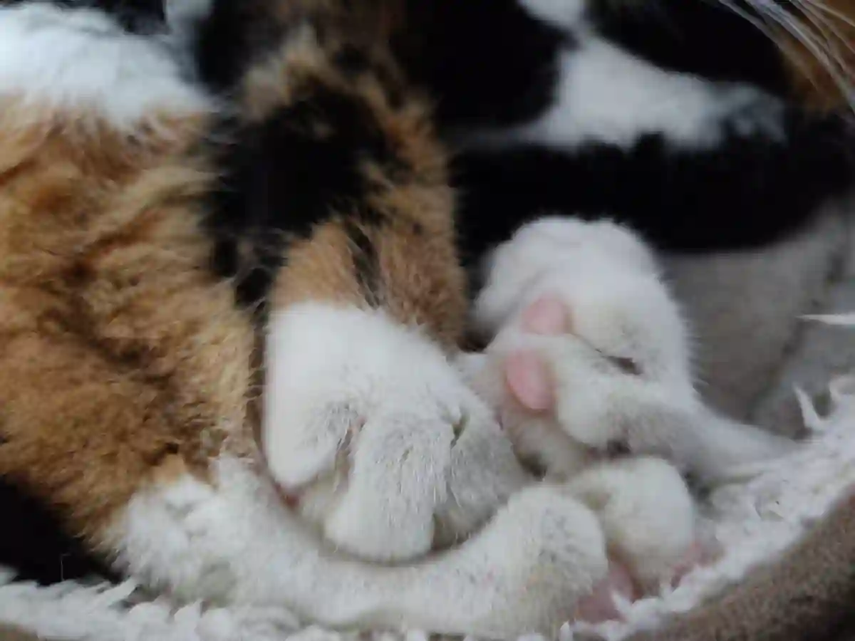
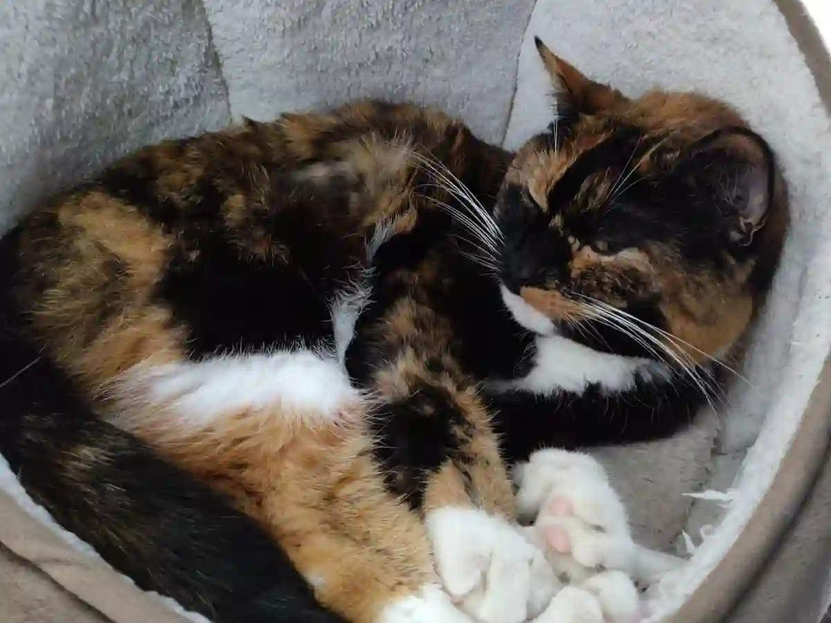
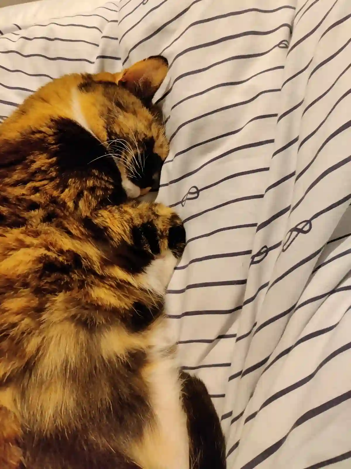
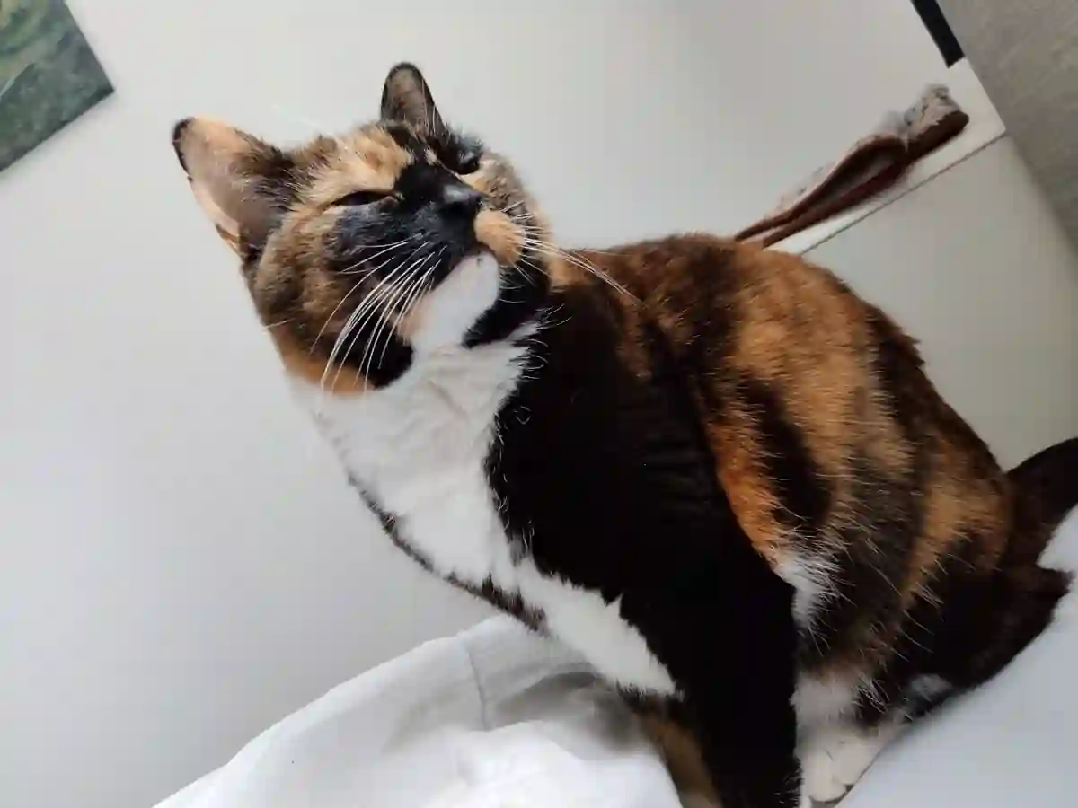
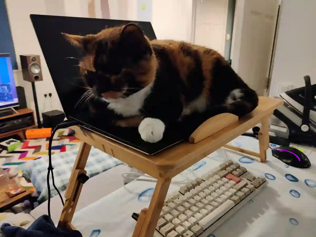
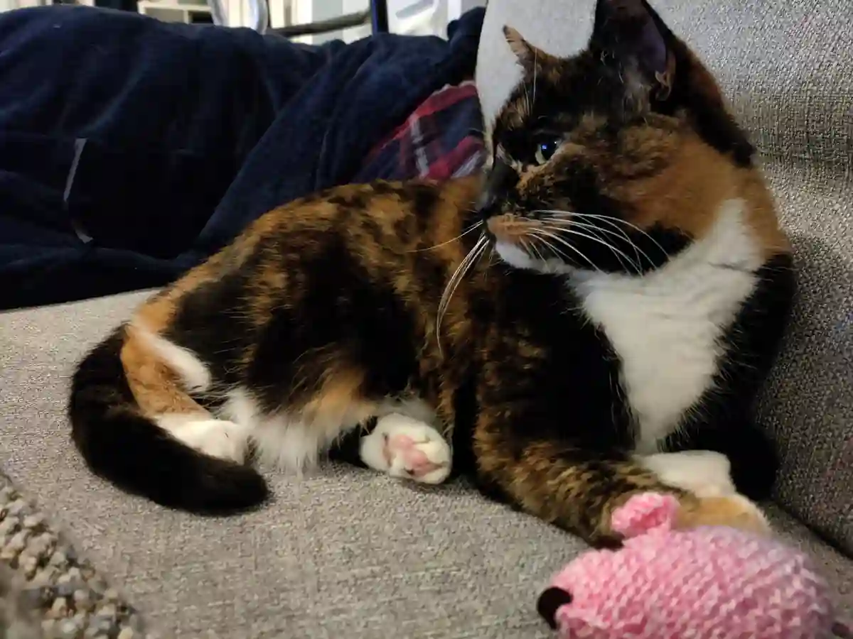
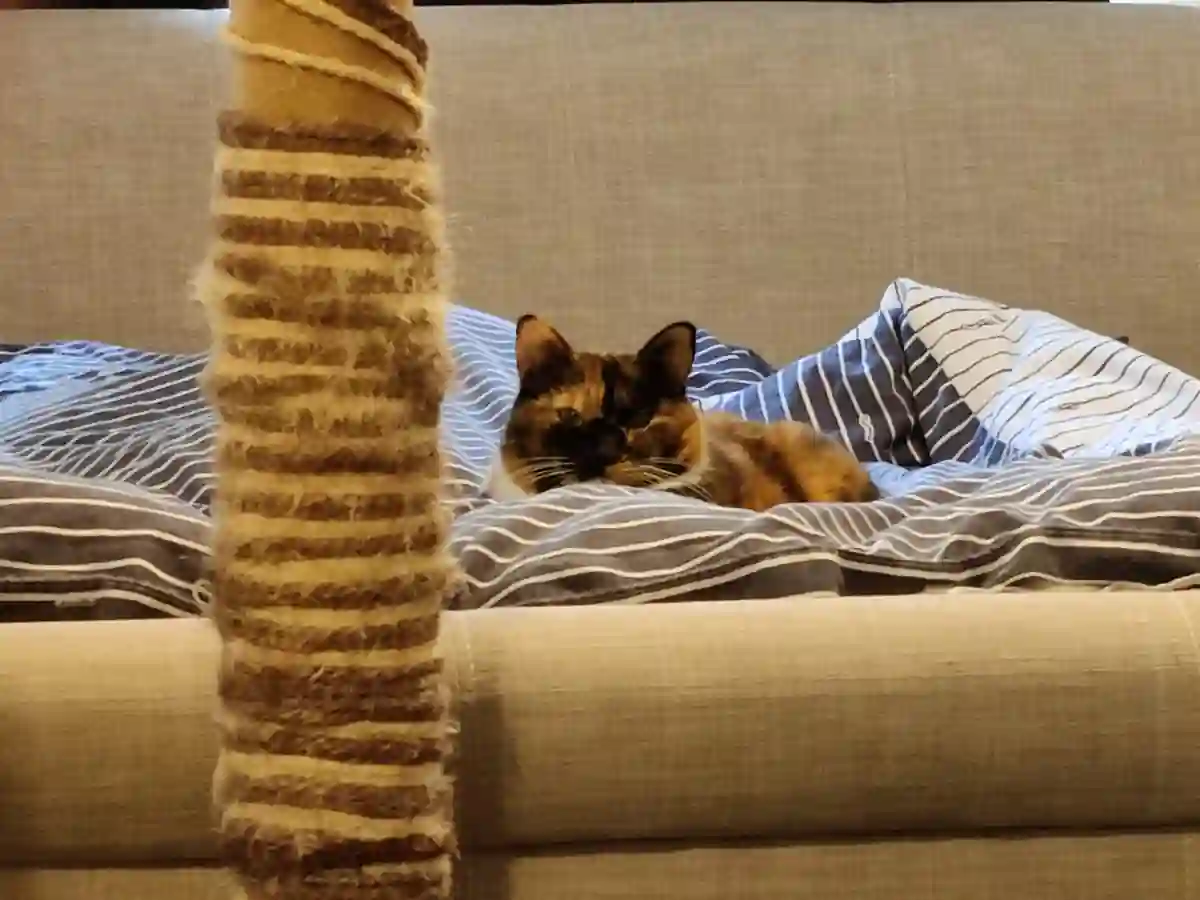
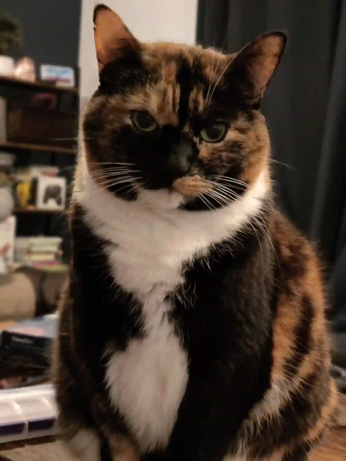
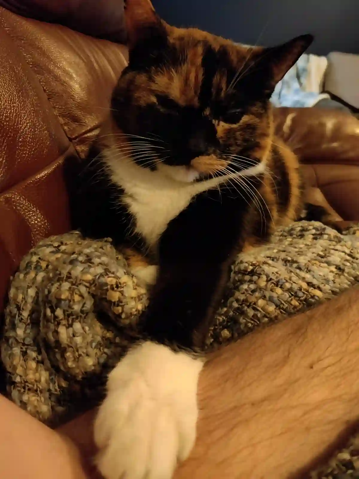
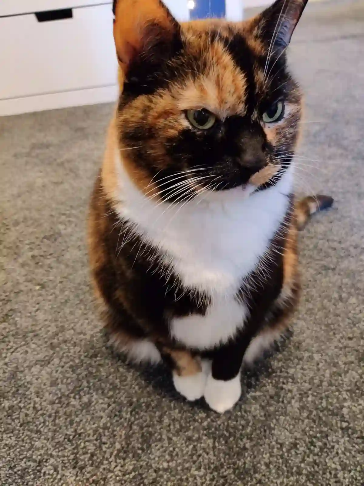
Cat Images in WebP
This post is a little test to play around with a few things:
- Images in WebP
- CSS grid image gallery
- CSS only image expand/overlay
View the page source at around this point to see the CSS & HTML used. Below is the bash script used to convert the images from JPEG:
#!/bin/bash
for filepath in ./original/*.jpg
do
filename=$(basename -s ".jpg" "$filepath")
echo $filename
convert "$filepath" -quality 10 -resize '1200' -define webp:lossless=false -define webp:method=6 "./out/$filename.webp"
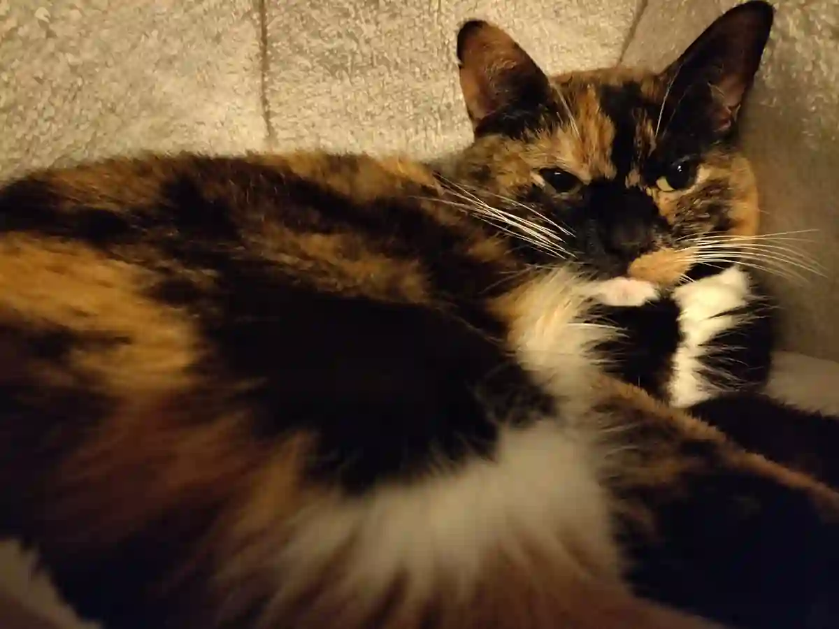
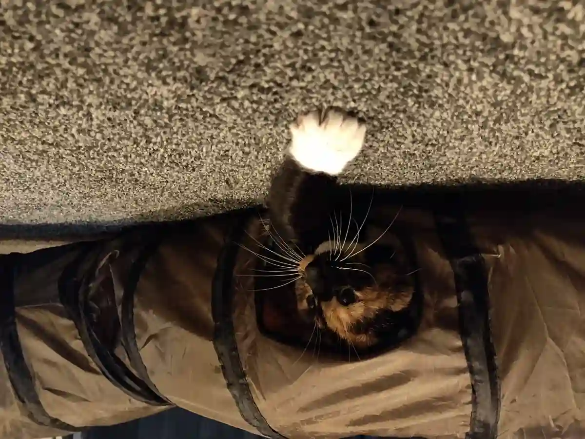
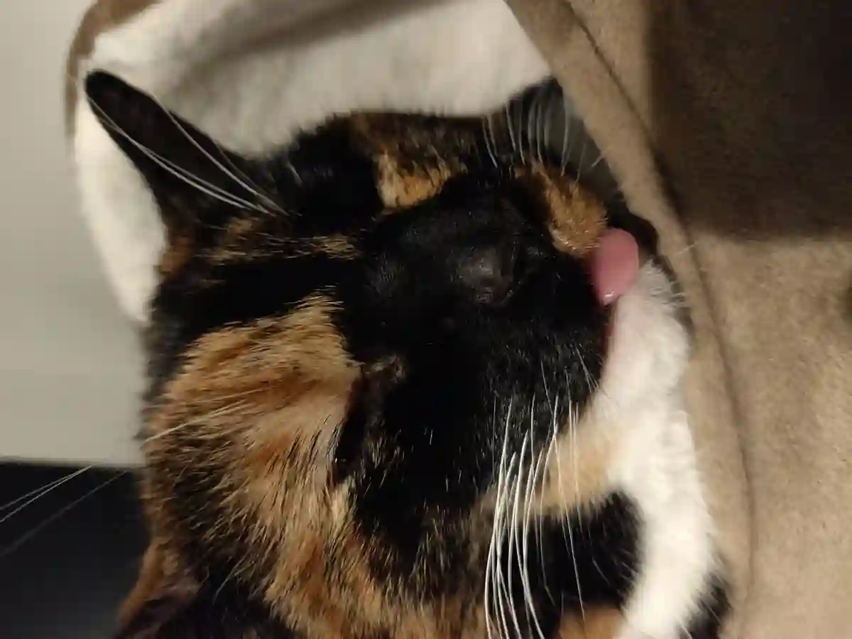
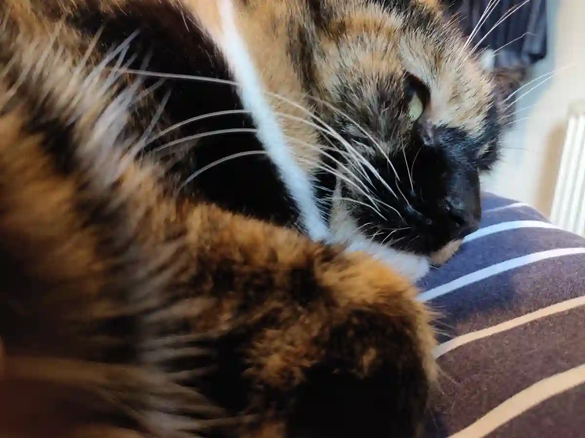
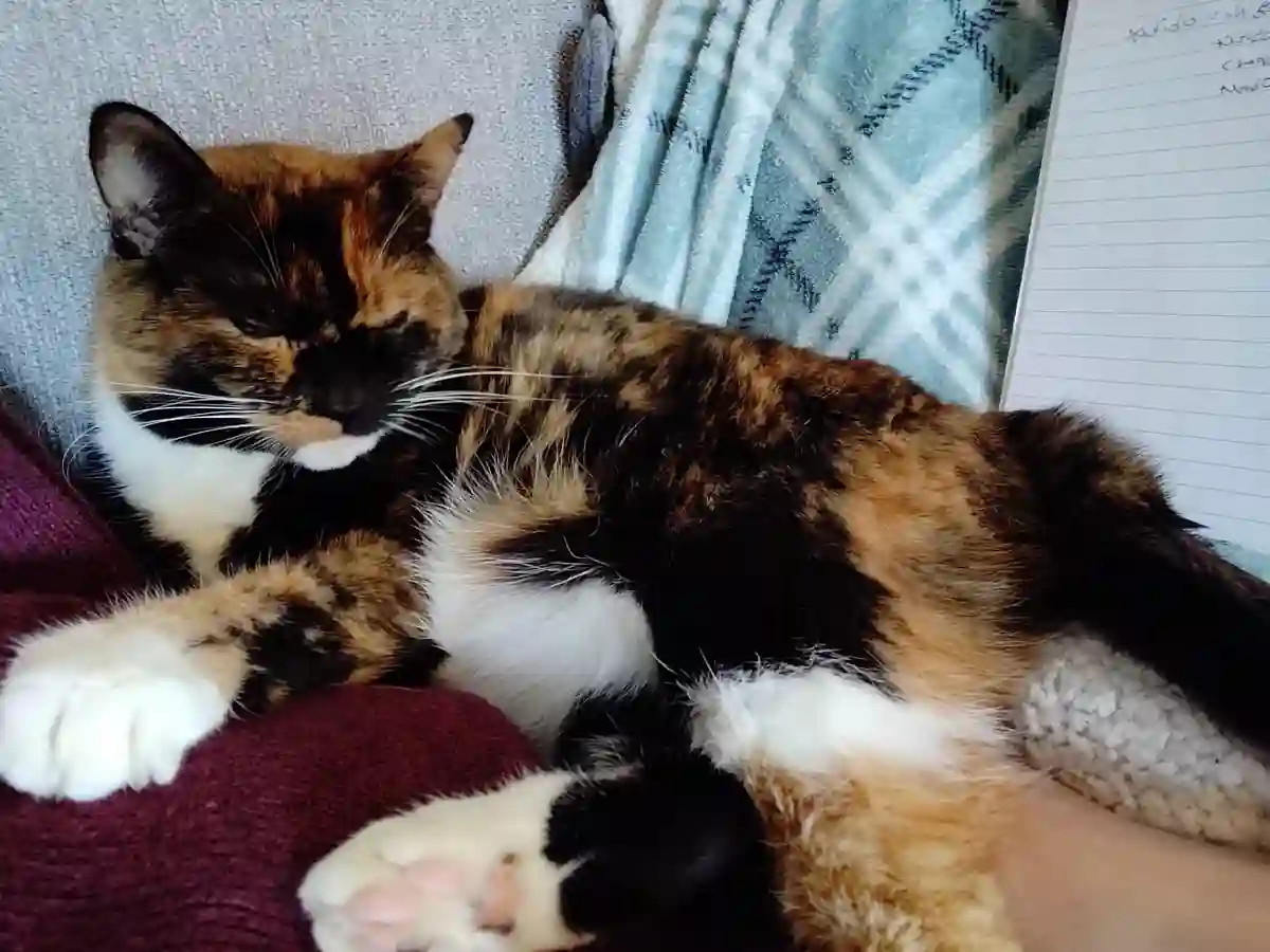
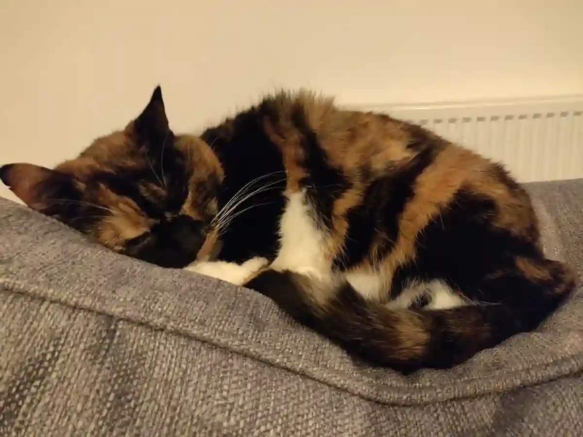
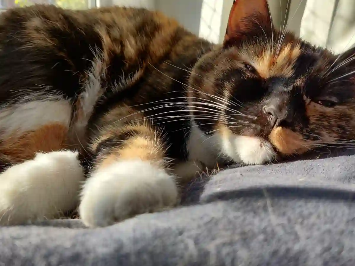
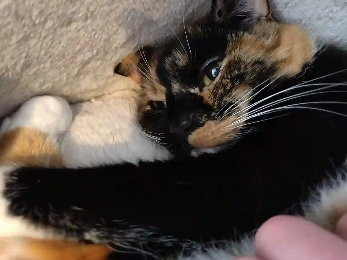
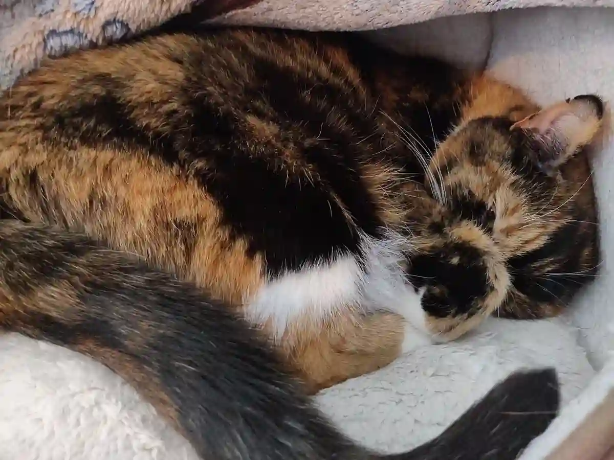
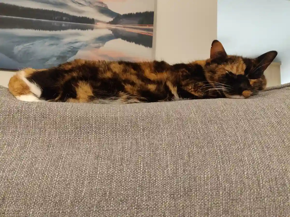
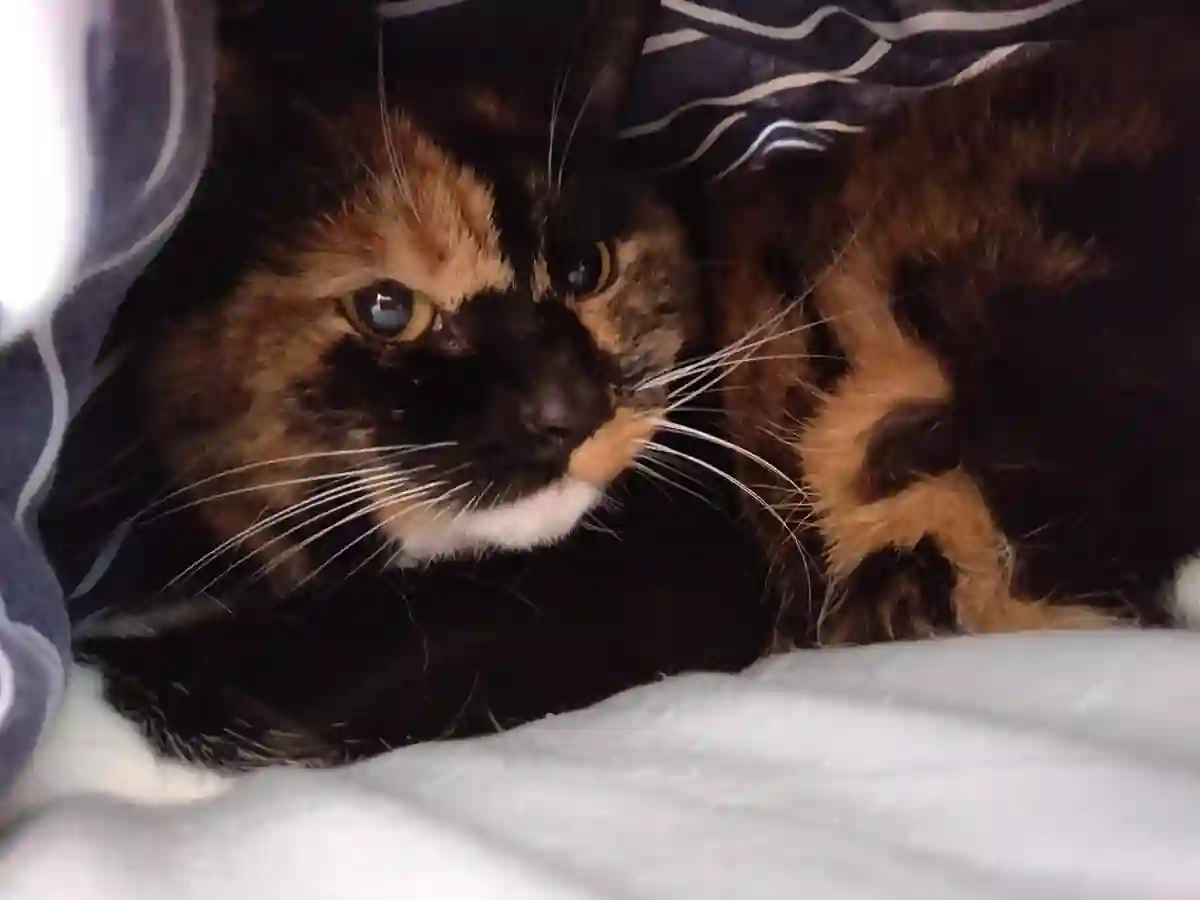
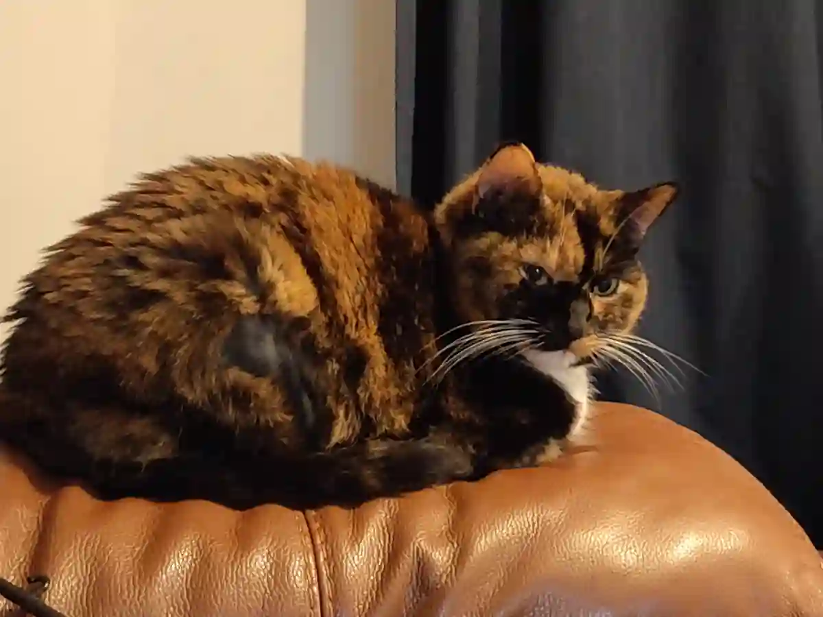
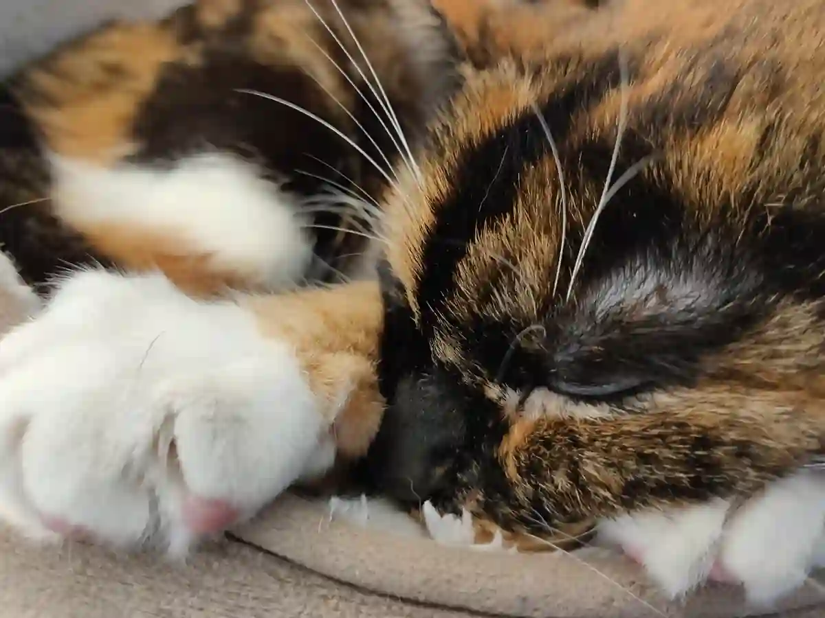
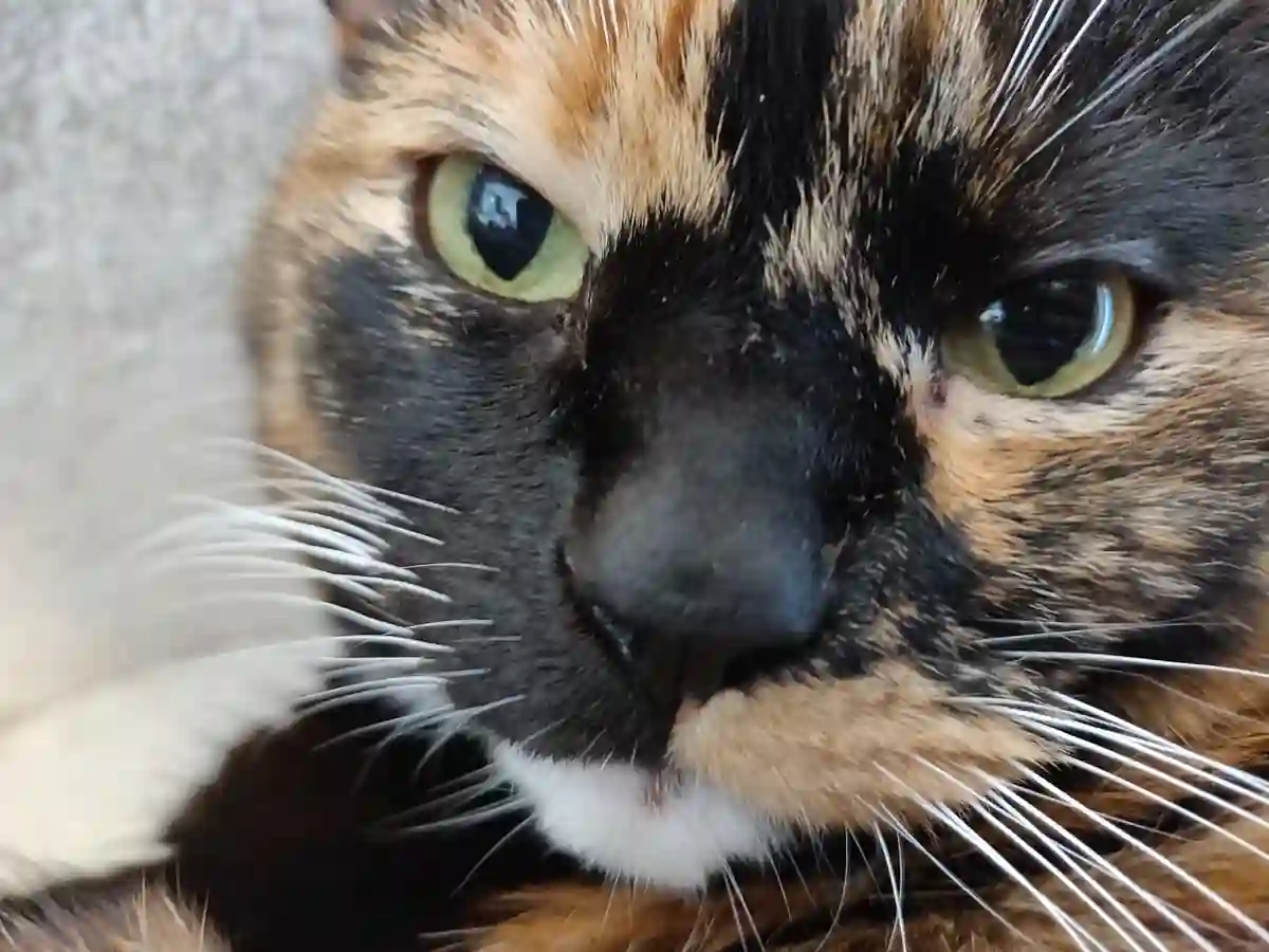
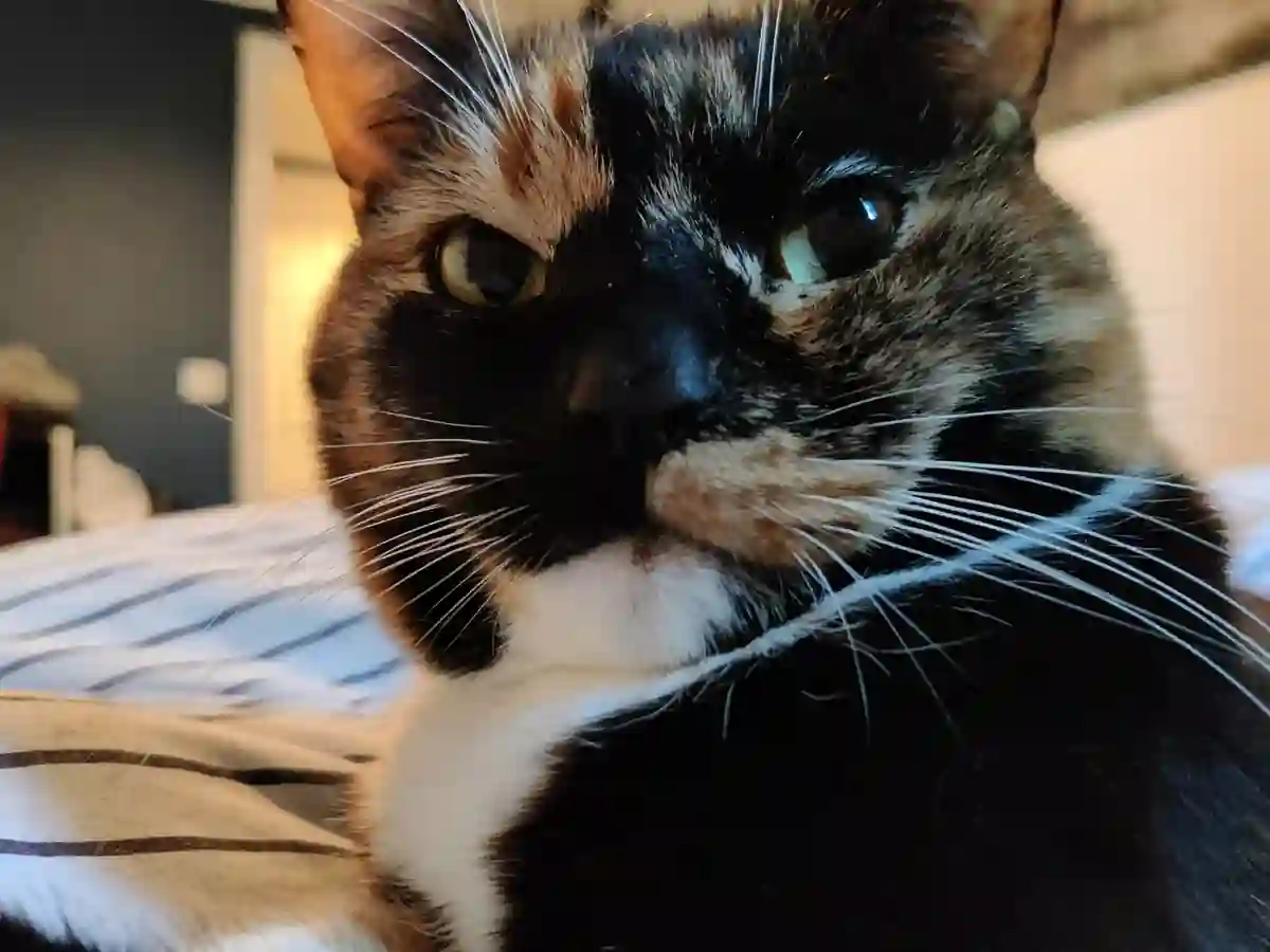
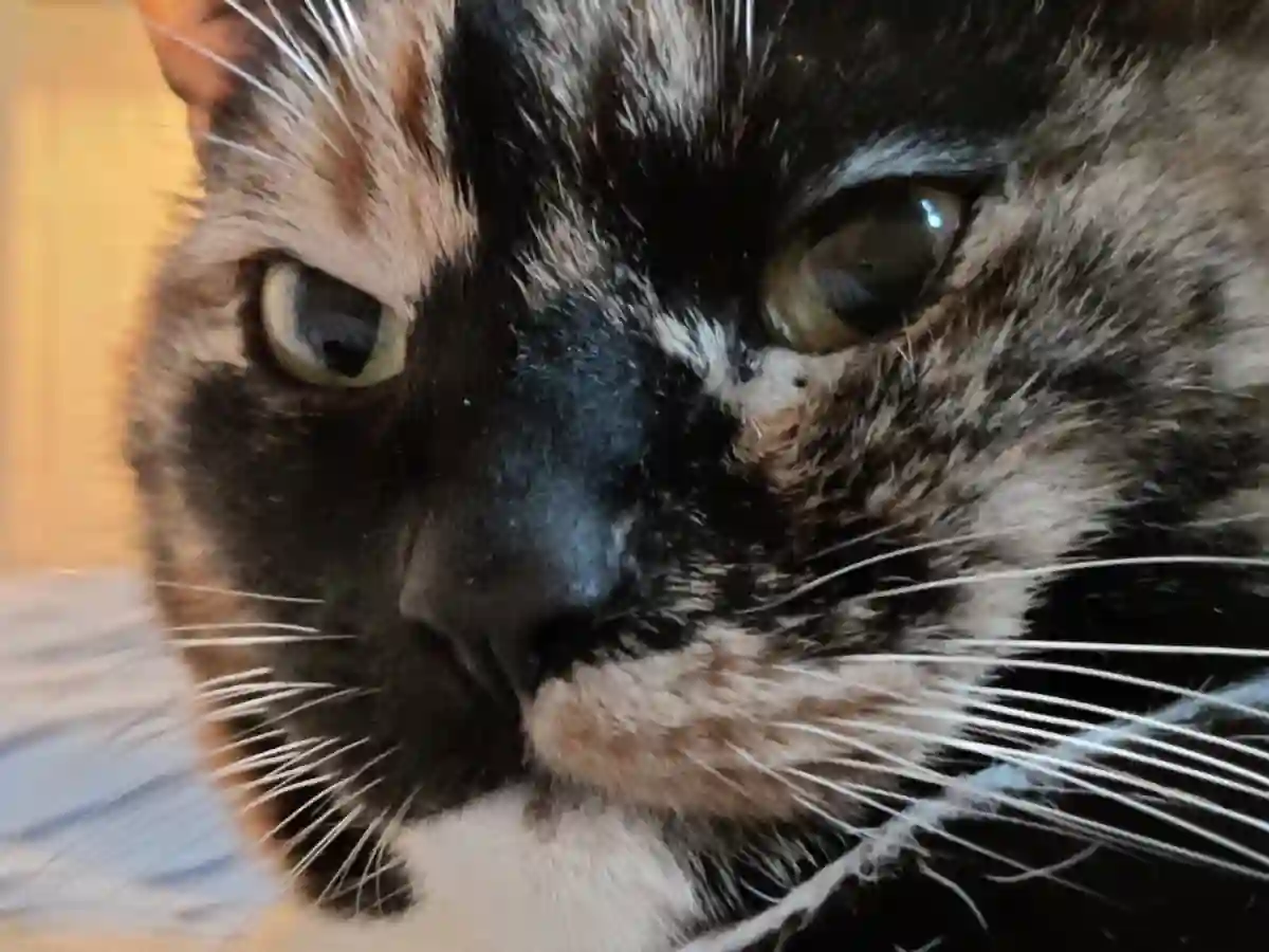
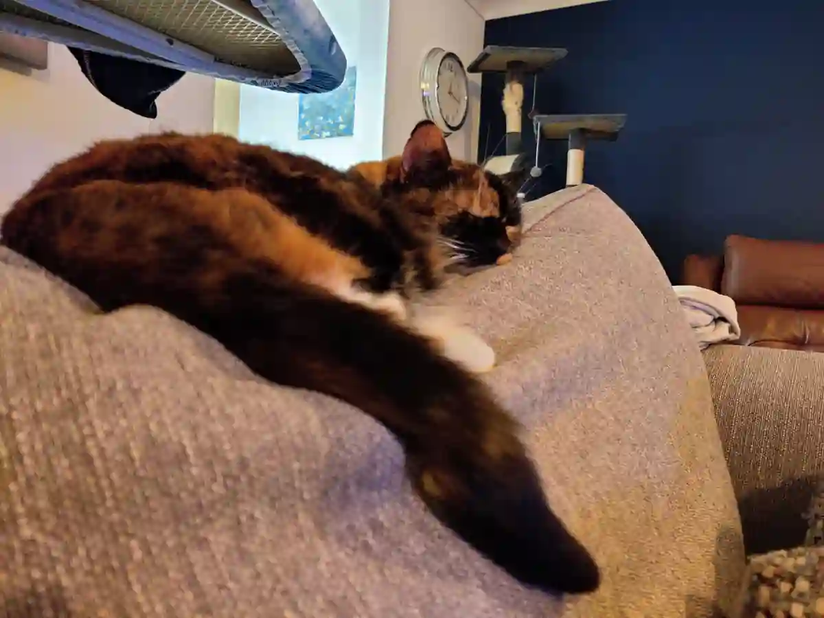
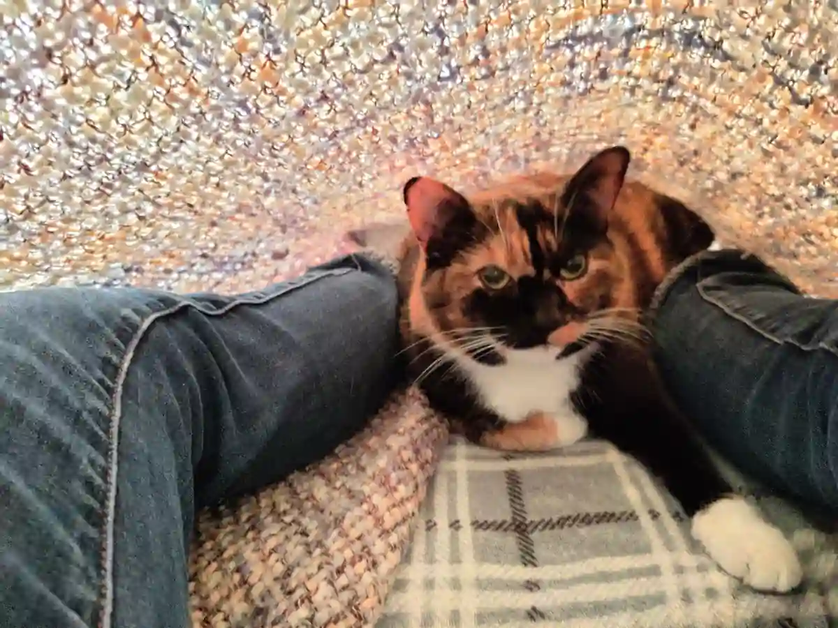
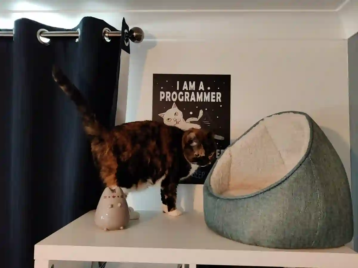
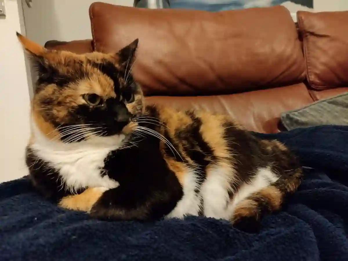
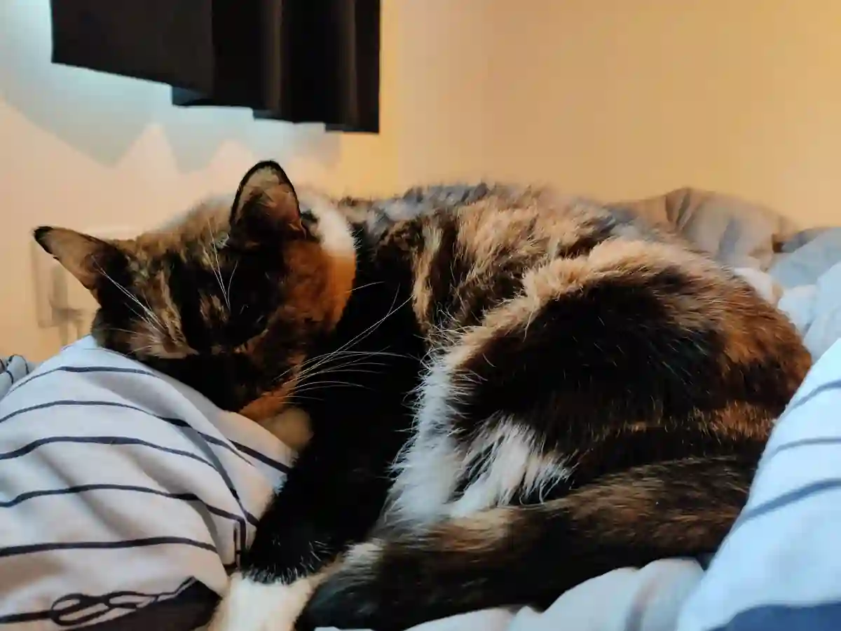
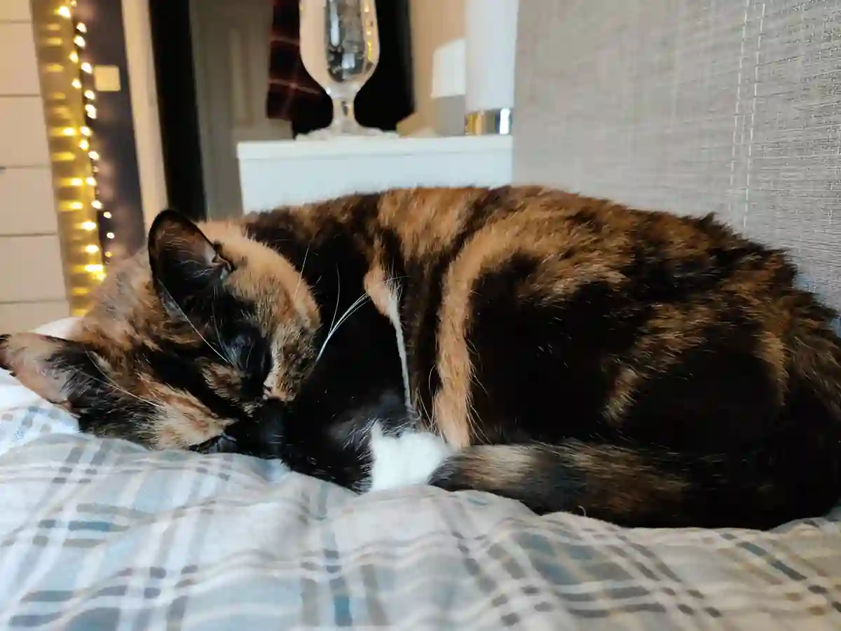
doneLoaded in are 42 1200px wide images of my cat Ruby, totalling 2.6MB total image filesize. Images are set to lazy-load so they may not all be fetched upon page load. The image expand/overlay functionality is simplistic, just to get something barely functional. Could achieve greater functionality by wrapping each img tag in a div but I wanted to see what I could quickly achieve with a plain list of image tags within a single grid parent.


Discoveries
WebP works very nicely for photographic images. In the above I used a quality setting of 10% to really get the filesize down, and they've held up quite well. Seems to "break down" in quality in a much more natural way compared to JPEG with more of a blur than a blocky-mess. An average of 61KB per image seems quite reasonable at 1200px wide.
The gallery works on old focus-based tricks with some newer CSS added in. Since it's focused-based
you can use tab to traverse the gallery. Grid works nicely to lay out the images with ease using auto-fit
repeating columns to adapt the column count.
The newer object-fit and aspect-ratio properties are used to fix the images into
the square grid without odd blank spaces.
One of the main challenges with the pop-up image view was getting the image somewhat central, while working
with a set max-width to not over-stretch the image. This would be easy with a wrapping element but, lacking
that here, I found a left position of max(calc((100% - 1200px) / 2), 4vw) to do the trick.
Another challenge was mobile Safari specific. I needed the "Back" button (Shown above the popup image) to
take focus away from the selected image. Most browsers did this by default but Safari needed something focusable.
I instead had to make the gallery wrapper (Which also contains the button) focusable and then adjust the button
CSS selector to .cat-image-grid:focus-within:not(:focus):after to ensure it shows when an image
within the grid is focused but not when the grid itself is the focus.
PS. I'm pretty sure these methods are not great for accessibility and there are tweaks and improvements to be made. Again, this was just for playing around and discovering some new techniques.